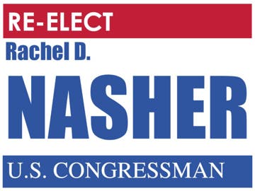
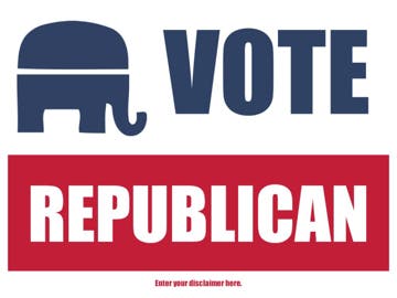
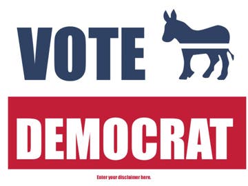
Tips for Designing a Campaign Sign: 5 Things You Should Consider While the media tends to focus a majority of their airtime on high-profile political races, in most races voters actually have very little information about the candidates. In these instances, name recognition turns out to be one of the biggest deciding factors at the polls. Campaign teams understand that an effective way to increase the chance of a win is through campaign signs. Campaign signs provide a budget-friendly solution to market a candidate, compared to alternatives such as newspaper and broadcast ads. Here are some tips you will want to consider when it comes to designing a successful campaign sign:
- Colors: Do not use the same color combination as your competitor. Choose a combination that is easy to read both in broad daylight and at night. An easy rule to remember is to use dark fonts against a light background or vice versa. But stay away from using a white background with black lettering as this may be interpreted as boring or too traditional.
- Material: The campaign will likely be printing signs on various materials that work best for specific locations – inside malls, on lawns, along the highway, etc. The design should look sharp and be easily readable on various materials. For example, at BuildASign.com we print campaign signs on materials ranging from corrugated plastic to reflective aluminum.
- Text: Putting too much information on campaign signs may work against the candidate. Since most signs are aimed at motorists and pedestrians, campaign signs have a few seconds to grab someone’s attention before they have moved on. Use compelling text or an identifying phrase/logo of the candidate. Consider eliminating obvious phrases such as “Vote For” and “Re-Elect”.
- Size: As with material, signs will be printed in different sizes based on the location they will be displayed. When designing your signs, make sure the text is visible on a range of sizes. Sometimes small signs give off the impression of defeat while big signs signal intimidation. Balance these factors with the appropriate messaging.
- Disclaimer: Check local election rules and regulations when it comes to disclaimers on campaign signs. The design of a campaign sign will need to be adjusted if a disclaimer is required. Find out ahead of time to ensure the disclaimer text fits in seamlessly with the main body and messaging of the sign.
Check out our custom posters to help spread the message about your campaign! Our easy poster maker allows you to design in just minutes!


 Order Status


