-
Signs
Signs

-
Sign Type
-
Shop By Industry
-
Traffic & Safety Signs
-
Vehicle Signs
-
A-Frame Signs
- Shop All Signs
-
Sign Type
-
Banners
Banners
-
Hanging Banners
-
Standing Banners
- Shop All Banners
-
Hanging Banners
-
Flags
Flags
-
Standing Flags
-
Hanging Flags
- Shop All Flags
-
Standing Flags
-
Vehicle Signs
Vehicle Signs
-
Tradeshow
Tradeshow
-
Tradeshow Displays
-
Standing Banners
-
Canopy Tents
- Shop All Event Displays
-
Tradeshow Displays
-
Stickers & Decals
Stickers & Decals
-
Window & Wall Graphics
-
Stickers & Labels
-
Vehicle Graphics
- Shop All Stickers & Decals
-
Window & Wall Graphics
-
Sign Holders
Sign Holders
-
Yard Sign Holders
-
Other Holders
- Shop All Sign Holders
-
Yard Sign Holders
-
Marketing Materials
Marketing Materials
-
Paper Products
-
More Products
- Shop All Marketing Materials
-
Paper Products
-
Gifts
Gifts
-
Wall Art
-
Personalized Gifts
- Shop All Home & Gifts
-
Wall Art


-
Signs
Signs
-
Sign Type
-
Shop By Industry
-
Traffic & Safety Signs
-
Vehicle Signs
-
A-Frame Signs
- Shop All Signs
-
Sign Type
-
Banners
Banners
-
Hanging Banners
-
Standing Banners
- Shop All Banners
-
Hanging Banners
-
Flags
Flags
-
Standing Flags
-
Hanging Flags
- Shop All Flags
-
Standing Flags
-
Vehicle Signs
Vehicle Signs
-
Tradeshow
Tradeshow
-
Tradeshow Displays
-
Standing Banners
-
Canopy Tents
- Shop All Event Displays
-
Tradeshow Displays
-
Stickers & Decals
Stickers & Decals
-
Window & Wall Graphics
-
Stickers & Labels
-
Vehicle Graphics
- Shop All Stickers & Decals
-
Window & Wall Graphics
-
Sign Holders
Sign Holders
-
Yard Sign Holders
-
Other Holders
- Shop All Sign Holders
-
Yard Sign Holders
-
Marketing Materials
Marketing Materials
-
Paper Products
-
More Products
- Shop All Marketing Materials
-
Paper Products
-
Gifts
Gifts
-
Wall Art
-
Personalized Gifts
- Shop All Home & Gifts
-
Wall Art
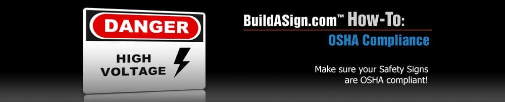
NOTICE: The following tips are only design standards. If you are unsure about whether or not your sign will be OSHA compliant, we recommend you visit the Official OSHA website for full compliance requirements and guidlines.
Which heading do I use?
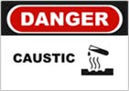
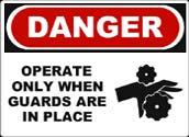
Danger
Warns of hazardous situations or unsafe practices with high risk of severe injury or death.
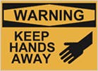
Warning
Warns of hazardous situations or unsafe practices with some risk of severe injury or death.
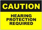
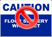
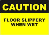
Caution
Warns of potential hazards or unsafe practices that could result in minor to moderate injury
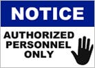
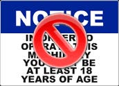
Notice
Indicates a statement of company policy; relates to the safety of personnel or protection of property.
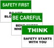
General
Indicates and reminds workers of safety procedures, and marks the location of safety equiptment.
What other standards should I follow?
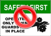
Choose the appropriate heading.
Each heading warns of a different risk level. Danger headers should only be used if there is an immediate risk of severe injury or death.
Do not exceed five lines of text.
Keep the text concise. You will be able to use a larger font and the sign will be easy to read.
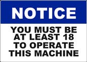
Use appropriate colors.
Follow the guidelines shown above to maintain consistency with header, text, and panel color.
Follow icon guidelines.
There should only be one image on the lower panel of a safety sign if using clip art. It should be placed on the right hand side.